Episode Transcript
[00:00:08] Speaker A: Hello and welcome to MB&A's Monument Matters, a podcast produced by the Monument Builders of North America for all things monumental.
MBNA is a 119-year-old association whose mission is to define and promote memorialization in a viable, innovative and diversified way for its members members and to enhance awareness of memorialization by the general public and the entire remembrance industry.
In that spirit of promoting memorialization, the MBNA Marketing Committee is providing these podcasts as an extension of our monthly magazine MB News.
Each podcast episode features a discussion related to a magazine theme. Monument Matters podcasts invite everyone to listen and share so you'll find all of our episodes of our first season on Apple, Spotify and YouTube.
I'm your host Mike Johns, CMAICA from the Johns Caravelli Company Cimarano Monuments and Flowers in Cleveland, Ohio. I'm also a past president of the Monument Builders of North America. Today I'm speaking with Brandon Bilister, owner of the Monument Lettering center, where he specializes in creating monument fonts and matching lettering as well as researching the industry's design and lettering history. He has a background in fine art with a degree in drawing, and he's worked designing memorials since 2008. I will also say invariably when on Facebook someone says hey, help me out with this font, Brandon is generally one of the first three responders with an answer and an identification. So Brandon, welcome to our podcast.
[00:01:49] Speaker B: Thank you Mike for having me.
[00:01:52] Speaker A: Identifying and matching fonts, like I said, is a significant nearly daily challenge for monument builders. So tell me what drew you to the industry and the service and what services do you provide and how did you get really into the whole lettering portion in the history of that part of our industry?
[00:02:14] Speaker B: Yeah, so I, I joined the industry in about 2007 and I had a background in fine art but was working at the time in the more corporate design space. So I was working. I'm from the Seattle area and so there's a lot of startups here. I was working in that space doing more corporate design and I was looking more for for ways I could use my art background and drawing and in the monument industry kind of out of the blue. I wasn't looking for it, but I saw a job posting and thought, huh, interesting.
I never thought of the monument industry as something that I could do for work, but I thought that that sounds fun.
And so it was really my love for drawing that that ended up bringing me to the industry.
And while working at a monument company and just looking at the the different fonts available, I started wondering where they came from the, the digital versions that I had seen were nowhere else in the design world. It seemed very specific to the monument industry. And so I started doing research at that time into where did these, where did these fonts come from, who designed them. And there was very little information out there.
So that's how I got, how I got my start.
And I've always just had a love for lettering in general and so it was kind of a natural fit for me once I joined the industry.
And as far as my colleague current contributions through the Monument Lettering Center, I create digital fonts based on the old, original plastic for the most part, old plastic and metal lettering, some old blueprint alphabets and I also do match lettering for about 150 shops all over the US and Canada.
They come to me with their difficulties jobs, either fonts they can't find or just custom hand drawn lettering and calligraphy.
[00:04:35] Speaker A: It's nice to hear that there is still a need or desire to have people using a triangle and a compass and a divider. Right. That's, you know, we could, we could talk about fonts for hours and hours. Right.
Especially as they have changed in our industry and how they've changed our industry.
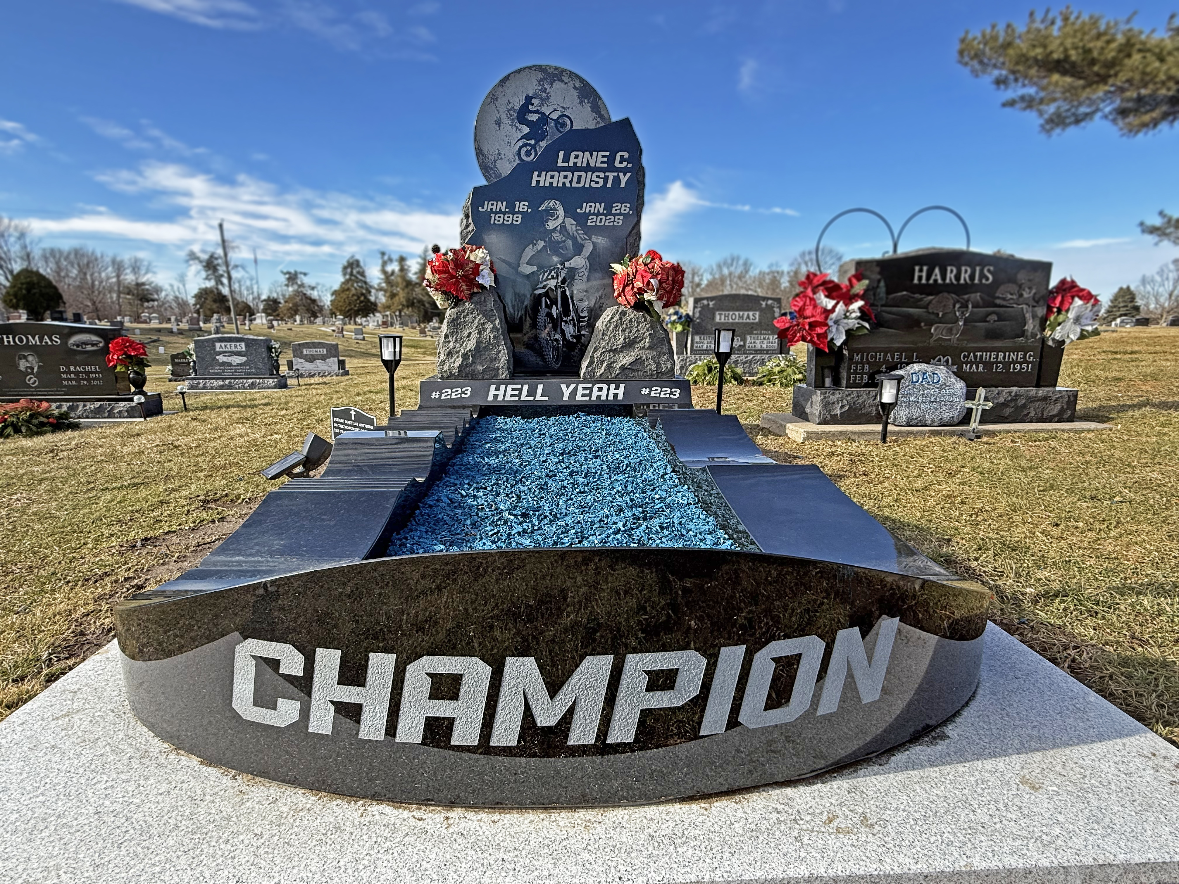
But what I'd like to talk about a little bit today is a project that MBNA is looking at to get off the ground and that is related to Timothy Jello. Timothy Jello, for those of you who have not heard the name, was one of the co founders of the Spacewide company and he was, they were responsible for many of the fonts that we use today.
So the, the board is, the board of directors and the editorial advisory board of directors for MB News is looking to create a design challenge in hopes of actually marking the grave of Timothy Jello, which is kind of amazing given the fact he's done so much for our industry in terms of lettering to learn that his crave is unmarked.
So you want to talk about that for a little bit, Brandon?
[00:06:14] Speaker B: Sure. That's something that I'm very excited that the MBNA is going to be working on.
I was a little bit shocked myself to find that his grave had never been marked.
More saddened really than shocked because of his contribution.
But that's actually something I find as I'm researching different designers, memorial designers, is that a lot of them, they devoted their, their, their life's work to creating memorials and they themselves either have an unmarked grave or very minimally marked grave without a real monument, but maybe just a flat marker or something.
And, and so I'm excited that the NBA is doing this. I, I talked with Timothy Jello's granddaughter and she's very excited about it as well. She's the reason I found out that he, that he had an unmarked grave actually.
[00:07:14] Speaker A: So, you know, we've all heard the axiom that shoemakers, kids have no shoes. Right. It's kind of the same thing going on here. Right?
[00:07:24] Speaker B: Yeah.
[00:07:26] Speaker A: So to understand the significance of Timothy's innovations, remind us how monument lettering was done prior to 1920.
[00:07:35] Speaker B: Yeah, so before, before the Spacewright Company produced their first metal letter sets in 1925, almost all lettering was, was drawn by hand.
And that, that goes for either hand carved or sandblasted lettering.
And so it was very time consuming.
You would have some sets of metal letters or perhaps from the research I've done in old trade magazines and books, there were some companies producing different letter sets.
But the majority, and you can see this for yourself as you've walked through old cemeteries, the majority of memorials were being hand lettered. And so the sandblasting technology had been around for a long time at this point, but it was just in its infancy still its early years in the 1920s, by maybe 1915 it was, it was becoming a larger part of the industry, but people were still trying to figure out how to use it. A lot of trade magazines and books at the time were explaining to folks how to best use it. And so still a lot of hand drawn lettering, sandblasting just getting underway.
And yeah, that changed really quickly when the Spacefight company came out.
[00:09:11] Speaker A: Yeah, absolutely did. Although I will say that we were one of the slow adopters of the Space Raid system. I mean when I started in 1975, we were still drawing every letter, every leaf, every bud by hand, cutting the stencil by hand.
So but that gave us a great background to build from when the computers started to come into play. You know, and I remember distinct, my grandfather, gotta love him. What are we gonna do with that computer? You know, he just couldn't fathom what, how it was gonna change our industry.
And you know, some folks use it as a tool and some folks use it as a crutch.
So there's good and bad in all of that innovation and it's just a matter of how you as an individual, you know, apply it to your everyday.
So as I said, he was a.
Timothy was a co founder of the Spacewide company alongside Antonio George Dabona.
So what innovations did they introduce and how did they impact the industry based on, you know, the change from how we did things by Hand to what, what was so significant about the space Rate system?
[00:10:50] Speaker B: So I would say there's really two main innovations and or at least byproducts of their, of their innovation. And the first one was accurate letter spacing. So the metal letters they provided were different in the sense that anything else that was out on the market at that time provided no way to have accurate spacing or consistent spacing. So if you were using other metal letters, you'd just place them down on the stencil and wherever you liked. There was no way to consistently place them.
And so what they, what, what Timothy did is he, from my reading, I don't know the, the exact mathematics behind it, but, but apparently he came up with a mathematical process for the spacing and that that ended up on the letters themselves being kind of a stair step that you'd see to provide kerning between different letter pairs.
And so that was a huge innovation because that in and of itself saved a lot of time. If you had some, some system before of creating consistent letters, you'd still have to, to hand draw them and hand space them. And now with the space right system, these metal letters, you had these, these kerning steps that fit into, into each other as you put different letter pairs together.
And so the, the time needed to, to lay out an inscription was cut drastically.
The other, I think main, main thing that they really changed in the industry as far as lettering is more consistent lettering for better or for worse.
Prior, prior to, to Timothy coming out with his, his classic Roman and modified Roman alphabets, two of the first that the company produced, you had, it was the Wild west as far as style and you had lots of different kind of Roman styles of lettering, some of them very poorly drawn, some of them drawn very well. But he, Timothy was a lettering specialist and he created a very nice kind of classic Roman and modified Roman Alphabet that to this day has been modified slightly, but is still the basis for all of our modified Roman fonts, depending on what software you use.
And so that consistency was good. But it also has its downsides too in that memorials tend to look throughout different points in time, tend to look very similar.
And the uniqueness of the individual doesn't necessarily come out or the uniqueness of the design doesn't come out when the modified Roman font is used exclusively.
So I know that there's a lot of final date engravers out there who would prefer that every memorial had not only the same Alphabet font on it, but only two sizes.
And I tend to think I like that there is some skill required in our industry in matching lettering. It's not just anyone can do it, but there's still some skill required in trying to figure out how to best match the lettering. So it looks like, it looks like it was engraved all at the same time, no matter, no matter when any additional lettering or information was added, that.
[00:14:48] Speaker A: Can definitely be challenging. But I do agree that being able to be creative and artistic in our approach is, you know, it's what makes memorials special for the individual. Right. And, you know, I remember my first experience with the just rub off letters, not a stencil press, but and looking at the steps that they created around the letters so that they would, this combination would connect this way and that combination would connect that way, and it really is amazing.
And I still don't understand how he came up with the formulas to create those because, you know, as you develop an eye, as a draftsman or someone that's drawing lettering, you understand, you learn to understand what the value of the letter is, what your eye sees as the beginning and ending of, of a letter. And so you, you learn how to put those combinations together.
But teaching that to an inanimate metal letter or trying to impart that to a computer, especially in the early days of computer lettering, it was very poor.
And some, some software gave you the ability to correct those errors in the software in those combinations, and others did not. And as they develop, it's getting more and more possible.
But again, there's folks that do it every day that understand that a letter has a value and presence and those combinations make a difference, and others that are just fine with clicking the keys away and, and whatever, the, whatever the computer gives them is, is good enough.
So, you know, there's, there's a huge spectrum from one designer to the next. Right.
So how did, how did his work set new standards or trends and, and why are they still so relevant today?
[00:17:21] Speaker B: I mean, I think at the time, there was a big push in the industry in the mid-1920s for the return to the classic Roman Alphabet, meaning mimicking the Roman Alphabet that was used on old monuments in Rome.
And so he, he continued that, that trend. And as people adopted his system, the, the classic Roman Alphabet actually in a way became minimized rather quickly and replaced with the modified Roman Alphabet. And the modified Roman Alphabet was, it was relatively new at the time. I've done searches in, in old trade magazines for the term as I scan them in. Part of what I do with my business is collect and scan in old trade magazines and books. And so I can do research because it interests me.
But I'll just type in a term like modified Roman and see when's the oldest use of that term in any of the trade magazines, at least that I have at this point.
And the term was actually not used very much prior to the space. Right. Modified Roman.
And it meant something a little bit different until Timothy Jello created his modified Roman which was basically a condensed classic Roman.
And then later they came out with an even further condensed Roman called the condensed Roman.
So the, the modified Roman Alphabet really took off.
I mean it went from almost non existent to being used by the mid-1930s on most memorials.
And so that was a big, a big change in the industry, the standardization of the Alphabet. Obviously a big change.
Suddenly you saw the same type of lettering no matter where you went in, in, in the US and Canada.
Now there was pushback. So on the other side there was at different points in time, I think maybe, Maybe in the 30s and 40s, the original pushback against the automated, more automated or standardized lettering.
But eventually that kind of gave way to, to the amount of time that could be saved.
So if the Monument company is trying to, to stay reasonably priced in their area and someone's using the space right system and they're not very difficult to, to compete over time.
And then maybe in the, in the 60s and 70s there was another push pushback with a lot of companies starting to, to value hand hand drawn lettering again and more customized design as far as the lettering.
So I think he, he really pushed things forward unintentionally with the modified Roman Alphabet and being able to fit that into, you know, small spaces where the classic Roman wouldn't fit.
And then inadvertently he had some pushback at different points in time against his standardized fonts that created new waves of custom lettering and calligraphy.
[00:21:08] Speaker A: Right. Well, you know, as a company we are still pushing back, I will say that.
But you know, on the flip side, the computer has brought hundreds of fonts to the availability of the designer. Right.
But just because you can doesn't always mean you should.
[00:21:29] Speaker B: Right, right.
[00:21:31] Speaker A: Is that I look at the. And you know, a great example has. Have you seen the Pope's headstone?
[00:21:41] Speaker B: Yeah, yeah.
[00:21:42] Speaker A: What did you think?
[00:21:46] Speaker B: It's a little sad.
[00:21:48] Speaker A: A little?
[00:21:49] Speaker B: Yeah, yeah.
It's not as if you could get lost in the design details and forget to look at the kerning, just lettering.
And so it seems, it seems sad that kerning could have been overlooked when it's so obvious the only thing on the memorial is the lettering. And but that's you know, that's kind.
[00:22:18] Speaker A: Of.
[00:22:21] Speaker B: The sad times we live in as far as ease of use with the computer and different tools.
We've in many ways lost at least widespread the expertise of individuals who know what they're doing. And that's seen as a valuable thing in society right now. It seems that we're teetering on the edge of design disaster when everyone can make anything they want at any time without expertise.
You know, you, you do lose a lot of value.
[00:23:05] Speaker A: You surely do. You know, my dad for years would, would put on programs about lettering, font choice, size, kerning, and invariably he put up a combination of letters and asked the audience to take a look and everybody would think, oh that's great, I don't see anything wrong. And then he would put up another slide because there were slides in those days with those letters properly kerned or in, in our opinion, kerned differently, let's say kerned differently. And invariably to a man they could see a difference. They could recognized the beauty of the second line but couldn't always articulate why.
Until he started talking about again the value of the letter. And look at why this, you know, you don't measure it a letter tipped tip, because this is what happens. And so you know, when you see it done properly, your eye is pleased, but you don't always recognize when it's not done properly until you start to see it done a different way and develop that appreciation. So, you know, again, we could talk about lettering and the pros and cons for hours today, but that's not specifically what we want to get accomplished. So let's jet back a little bit to, to Timothy and his grave, his poor unmarked grave. Can you tell me what, what did you learn? Why is it unmarked? What, what's the story?
[00:24:54] Speaker B: Well, he, so Timothy Jo died in 1932, not long after the spacewalk company started.
I don't know exactly how he, he died.
I've spoken with his granddaughter a little bit about his life, but of course she didn't ever meet him. And according to her there, she's spoken to her cousins and nobody has any images of him.
So he, he died from what I know, basically penniless.
I think originally it seemed like he was doing really well. I mean the space right company in their first year sold about 800 or sold sets of, of letters to about 800 shops all over the the US and Canada.
And they promoted that, you know, in, in advertising they said you better jump on board. There's already 800, you know, other companies using the system.
And he was, I mean, apparently well off enough to be developing streets construction in, in, in Massachusetts, where he was from.
So it seems like he, he did well for the first few years and then the depression hit and I don't know exactly what happened, but he passed away in 1932 and, and very, very poor at that point. So that's about all I know.
So he was buried in a, in a grave plot, but it's possible that his, his widow just did not have the funds left over to put a, a marker on the grave. And I don't know enough about the family history to know exactly why. No one else had done that. The woman I've talked to was doing a lot of family research in the 1990s, I think, and so that's when she found out that his grave did not have a marker on it.
But she seemed very excited at the possibility of that for him.
[00:27:12] Speaker A: Well, that's great. So more details to follow on that whole idea of design competition contest.
The board and the EAB are not exactly sure how this is going to shape up, but it is something that they're actively taking a look at. So I'm sure that we'll be seeing more information about that in the coming months.
So at this point, I guess it's time to thank you, Brandon Billisthur, for taking time out of your schedule to share with me and our audience.
If there's no okay, that's going to get cut right out. All right, so the June issue of MB News celebrates all of the MBNA Award winners along with details of the design challenge to honor Timothy Jello. I hope that's going to be the case.
So it's time to get out your doodle pads and create a concept for his stone and watch for information on how to participate in the fundraiser to complete this project. All right, so thanks for listening to monument matters. MBNA invites you to stay connected through Facebook and LinkedIn or visit www.monumentbuilders.org for upcoming events and webinars for MBNA. That's Monument Builders in North America. I'm Michael Johns. Thanks for taking time out of your day to listen. If you found this worthwhile or you want to get involved in marking Mr. Jello's grave, please take a minute and share the link with a friend for comments and feedback. We'd love to hear from you. Please drop a note to infoonumentbuilders.org thanks for listening and have a great day.